Most of the time it seems like my photographic skill hasn't progressed much since the six year old level, but I keep trying anyway.
The more I looked at that gallery, the more I wanted to try that kind of a photo, but I needed some older photos to draw from. Using someone else's photo in your photo, though, seems a little sketchy to me. Do you need their permission? Do you have to acknowledge that you used it? What if you can't figure out who took it? I don't know how copyright laws work, so I was a little worried to just start printing out someone else's work and then going to town. Instead, I looked through my own photographs and decided on a couple of likely candidates:
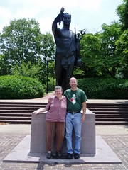
This is a picture from a few years ago of my friends Kim and Kevin. They were in town for a conference, and we hung out for a couple of days. During the mini-tour of campus I gave them, I took that picture at the Torchbearer statue. The advantages to using that picture, at least to me, were that I knew exactly where I'd taken it, it was taken in a different season, and it had an obvious landmark to focus on. I printed myself a copy and went back to the statue a couple of times to give it a try.
It turned out to be a hell of a lot harder than it looked.
Once I figured out how to line everything up, I had about twenty tries where either this happened:
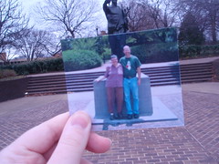
with the background in focus and the picture blurry or I shifted my hand or the camera a millimeter and the lines didn't match up anymore. I never got one with the bricks, the statue, the steps, and the lightpole in the background all matched up at the same time, but this one is the best of a bad lot, attempted on two different days:
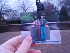
Not awful, but I'm still not happy with it. My irritation with that picture, though, pales in comparison to the nightmare that working with this one turned out to be:
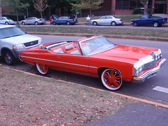
It doesn't look that bad, right? I know exactly where that corner is, there are multiple curbs in that picture to line up with, and I already had all that practice with the other picture, so it should have been easier.
Yeah. Right. I failed to take into account that when I took that picture I was apparently standing in a magical wormhole where the laws of space and time were suspended.
None of the lines in that picture match up with anything in real life. If the curb in the front lines up, the one in the back doesn't:

If the curb in the back lines up, the one in the front doesn't:
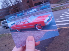
Oh, and the little sidewalk corner there? That NEVER lines up. I tried it standing on the grass, on the sidewalk, tilting the camera, tilting the photo, leaning, nothing worked. Like I said, the day I took that picture was apparently a special "No Physics Saturday!" or cosmic conjunction or something, because the angles and lines are impossible to duplicate. This is the closest I got, and I'm still not happy:
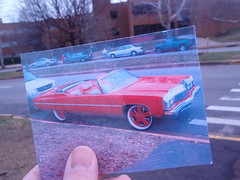
The back curbs, the tree, the building, and part of the front curb line up, and that's going to have to be good enough, because this project stopped being fun about ten minutes before I took that picture.
I bet you could do the whole thing really easily in Photoshop, though.
5 comments:
What a clever idea. Temporally layering these shots give them another dimension. (And I like the intentionality of holding th picture there). It wouldn't have the same resonance if it was photoshopped.
I love this project Joel!!!
brilliant. i should mail you some Guiness.
I love this technique. I'd love to try it myself some time.
Note in the gallery, all those pics aren't totally aligned either. I think it works best with just a little dissonance between the pictures. Yours were great!
I saw this on the Flickr blog as well! I thought it was a pretty cool idea. But a couple of thoughts...
1)www.flickr.com/creativecommons That website will give you a good idea of how you can use other people's pictures for your own work. You can figure out what kind of copyrights people have on their pictures by clicking the "all sizes" buttons and then looking for those creative commons badges and hovering over them with your mouse. If they have a "attribution" that means you just have to link back to their original flickr picture on their page with a little hyperlink in your description.
2) As for the lines not matching up, I'm pretty sure getting them to match exactly would be practically impossible. An inch different in the point of perspective with just a slight difference in focal length used on your camera create an almost impossible task to accomplish. Even the ones of Flickr don't match up perfectly.
A trick you might try would be the method that the "peace sign" picture did on the blog. It looks like they used some kind of foam board and adhesive to give the picture a three dimensional effect. That way it keeps the viewer from getting distracted from lines not meeting up.
3) And finally, not sure if your camera has the setting on it or not, but try to use an f-stop around f/11 or f/8 when taking your pictures. If you have a point and shoot it might be under a menu called Aperture priority. It would eliminate the problem of having the picture in focus and the background out of focus -- It just needs to be fairly sunny out so that you can take the picture without any hand shake.
;)
Post a Comment